The Sector Element
Used only in polar coordinates, the sector element is usually for plotting a pie chart. Here its basic plotting method and properties will be explained.
12.8.1 Data properties
The following ploting algorithm of pie chart for displaying vault results illustrates how to plot a sector element.
|
|
A |
|
1 |
=canvas() |
|
2 |
=demo.query("select * from GYMSCORE where Event = 'Vault'") |
|
3 |
=A1.plot("BackGround") |
|
4 |
=A1.plot("EnumAxis","name":"x","location":3,"polarX":0.55, "allowLabels":false) |
|
5 |
=A1.plot("NumericAxis","name":"y","location":4,"allowLabels":false) |
|
6 |
=A1.plot("Sector","axis1":"x","data1":A2.(NAME),"axis2":"y", "data2":A2.(SCORE),"text":A2.(NAME)) |
|
7 |
=A1.draw@p(400,300) |
A1 creates a canvas. A2 retrieves data for chart plotting:

A3 plots the background. A4 plots an enumeration axis as the polar axis x. A5 plots a numeric axis as the radial axis y. The Allow Labels property of both axes is set specifically as false, so that tick marks will not be plotted on the polar axis in case of causing confusion to the pie chart plotting.
A6 plots the pie chart using the sector element, which is our focus here.
First look at the plotting result of A7:
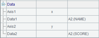
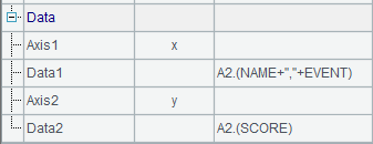
When plotting a pie chart with the sector element, a sector is plotted based on each group of data. A sector is a circle with its inside diameter being zero. The radial axis is a numeric axis showing scores of the athletes, according to which sectors with different central angels are plotted successively to eventually form a circle. A pie chart is in this sense similar to a stacked column chart discussed in The Column Element. Like a column, one sector can be positioned by only one data point whose angular value will be calculated cumulatively. A6 specifies the data properties of the sector element:

Here the given logical coordinates A2.(NAME) and A2.(SCORE) on both axes are sequences. Different from plotting a column chart, the plotting of a pie chart with single data series will identify the enumeration value on the enumeration axis, i.e. the polar axis, always as 1, which means only one pie will be plotted.
12.8.2 Appearance properties
As can be seen from the chart above, the result of chart plotting with the sector element is sectors with fill colors. This means the appearance properties of the sector element will include fill color, border style, border weight and border color. By default, the fill color is automatically generated with lighting effects. Now modify A6’s code into =A1.plot("Sector","borderWeight":1,"borderColor":-16724839,"fillColor":[["ChartColor",0,true,-52429,-13057,0],["ChartColor",0,true,-10066177,-3355393,0],["ChartColor",0,true,-13369345,-1,0]],"text":A2.(NAME),"axis1":"x","data1":A2.(NAME),"axis2":"y","data2":A2.(SCORE)). By doing so, the appearance properties will be changed as follows:

Set the color for border line as turquoise and the weight as 1, and specify a sequence of fill colors for the sectors. Thus the plotting result is:
As you can see, the appearance of the pie chart has changed. The default lighting effects of the fill colors have vanished and the gradient color has been applied to the entire circle area to achieve harmony among the fill colors.
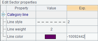
And, the pie chart’s data labels, different from those in other styles of charts, are presented by lines drew from the center of each sector. So you need to specify the appearance properties for these leader lines as well, besides those for data label texts. Modify the sector element’s chart properties by editing A6’s code:
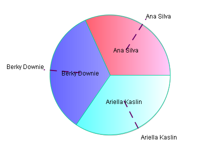
Then the plotting result is:
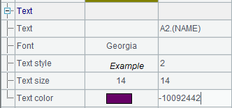
Now let’s see the text properties. The above plotting algorithm sets the data labels as names of the athletes. Modify A6 to change the chart properties of the sector element:
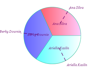
Here the text font, text style, text size and text color for the data label texts are modified, and the plotting result is:
It can be seen that the text properties apply in both the texts on the pie and those using leader lines.
12.8.3 Pie charts with series and categories
Similar to a stacked column chart, a pie chart can display data series and data categories at the same time. Yet they have differences. In a pie chart with both series and categories, the plotting results corresponding to data categories accumulate to form a ring or a circle, which represents the percentage of a certain category. Below is the plotting algorithm of a pie chart for showing results of different gym events. For the convenience of observation, A7 adds legends to the chart:
|
|
A |
|
1 |
=canvas() |
|
2 |
=demo.query("select * from GYMSCORE order by NAME,EVENT") |
|
3 |
=A1.plot("BackGround") |
|
4 |
=A1.plot("EnumAxis","name":"x","location":3,"polarX":0.55,"polarY": 0.4,"allowLabels":false) |
|
5 |
=A1.plot("NumericAxis","name":"y","location":4,"allowLabels":false) |
|
6 |
=A1.plot("Sector","axis1":"x","data1":A2.(NAME+","+EVENT),"axis2": "y","data2":A2.(SCORE)) |
|
7 |
=A1.plot("Legend","legendText":A2.id(EVENT),"columns":2,"x":0.2,"y":0.8) |
|
8 |
=A1.draw@p(400,400) |
Still, an enumeration axis is used as polar axis x, and a numeric axis used as radial axis y. A6 specifies data properties for the sector element. Note that Data1 includes both NAME values of series data and EVENT values of category data.
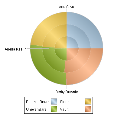
A8’s plotting result is:

So, in a pie chart with both series and categories, polar axis data should contain category and series at the same time. Based on data of categories, a circle or a ring will be plotted, with data labels presented by leader lines changed to series.
By default, a pie chart displaying percentage values with sector element will be plotted. You can only read the percentage of each event for each athlete. Modify the Stack type property in A6:
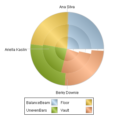
Here Stack type property is changed from the default Percent Stacked to Stacked. Thus, data in each category will be accumulated by statistical values, producing the following plotting result:

As can be seen, accumulated by values, the slices for all athletes will be plotted based on their scores and thus the plotting result for each category will not be a complete circle or a complete ring any more. As a stacked column chart, the total scores of the athletes can be viewed clearly through this type of pie chart.