Using Ready-made Graphs
So far, the documents on esProc charts have covered how to draw charts through plotting chart elements. Besides the user-defined plotting algorithms, esPorc alos provides a number of built-in ready-made graphs for plotting common styles of charts quickly.
There are four types of ready-made graphs (Column graph, Line graph, Pie graph, Dual-axis graph) available for use in writing plotting algorithms in esProc cellsets, in addition to chart elements like axes, graphs, and so on.
Now let’s see how to use these graphing short cuts and their plotting effects.
12.11.1 Column graph
Column chart is among the most commonly used types of charts. Use Column graph in esProc to plot a column chart. Take the following plotting algorithm as an example:
|
|
A |
|
1 |
=canvas() |
|
2 |
=demo.query("select * from FRUITS") |
|
3 |
=A1.plot("GraphColumn","categories":A2.(NAME),"values":A2.(UNITPRICE)) |
|
4 |
=A1.draw@p(400,250) |
You can see that the algorithm becomes much simpler with the ready-made column graph. It is unnecessary to plot chart elements, like axes, a figure, legend, and titles, that are components of a chart one by one. A1 creates a canvas and A2 retrieves the data for chart plotting:

A3 plots a column chart:
You only need to set data properties of Categories and Values to plot the chart. Here’s A4’s plotting result:
Using ready-made graphs is convenient by setting fewer parameters. Yet they produce fixed plotting styles. You can adjust the plotting effect by modifying the chart parameters, some of which, such as title text, axis color and legend properties, are shared by all the ready-made graphs.
First let’s look at the title text setting for the horizontal and vertical axes. Modify A3 into
=A1.plot("GraphColumn","categories":A2.(NAME),"values":A2.(UNITPRICE),"xTitle":"Fruits","xTitleFont":"Vivaldi","xTitleSize":16,"xTitleColor":-16764007,"yTitle":"Unit Price","yTitleFont":"Vivaldi","yTitleSize":16, "yTitleColor":-16737946,"yTitleAngle":90) to change the properties of column graph:
Titles are added for both the horizontal axis and vertical axis beside data labels. Thus A4’s plotting result is:
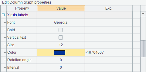
Modify properties of x-axis labels of the column graph:
Font and color are changed and A4’s plotting result becomes this:
The font properties of labels are similar to properties of titles, only with an extra Interval for displaying labels at certain interval.
The vertical axis of a column graph is a numeric axis, for which you can set font properties of labels as well as change value range, number of marks, and so on. Modify properties of y-axis labels:
By doing so A3’s code is:
=A1.plot("GraphColumn","categories":A2.(NAME),"values":A2.(UNITPRICE),"xTitle":"Fruits","xTitleFont":"Vivaldi","xTitleSize":16,"xTitleColor":-16764007,"yTitle":"Unit Price","yTitleFont":"Vivaldi","yTitleSize":16,"yTitleColor":-16737946,"yTitleAngle":90,"xLabelFont":"Georgia",
"xLabelColor":-16764007,"yLabelFont":"Georgia","yLabelColor":-16737946, "yEndValue":5,"yMinMarks":5). And A4’s plotting result is:

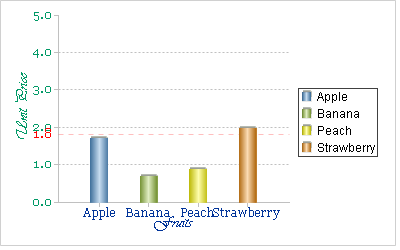
On the numeric y-axis, you can plot grid lines and the warning line. Grid lines are reference lines plotted according to tick marks. The warning line is plotted according to a specified warning value. Modify column graph properties as follows:

Here’s A4’s plotting result, on which you can see the grid lines and the warning line:
Change the axis color by modifying A3’s chart parameters:

This way the axis color will change accordingly. A4’s plotting result is:
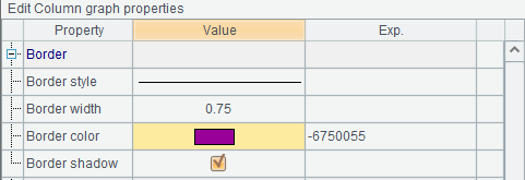
Besides, you can modify Border properties to change the graph outline; or modify Graph title properties to plot a title on the top of the graph. Modify column graph properties through A3:

And you get the following plotting result:

Add data markers on the top of each column by modifying column graph’s Data marker properties:
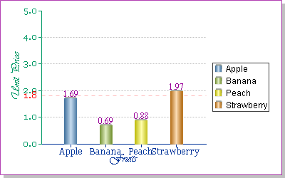
Choose to display the initial data values and data markers will be added to each column. Below is the plotting result:
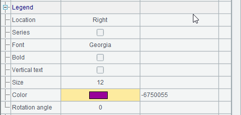
With a ready-made graph, set Legend properties to plot a legend:
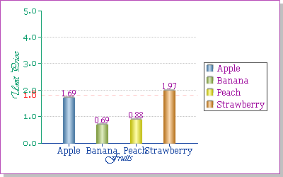
Then the plotting result is:

Modify A3’s chart parameters to change chart area color, allow text overlapping or not, and set other properties:

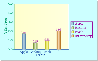
The modification involves setting Canvas color (of chart area), Back color (of the plane) and Legend border color (of legend outline), as well as changing Allow text overlapping to false, which means not plotting text if it may overlay the existing text, such as the Strawberry label on the horizontal axis in the above chart. Here’s A4’s plotting result:

These chart properties can be set not only for column graphs, but also for all other ready-made graphs. Here the property setting for them will be omitted.
Furthermore, the column graph can be used to plot a column chart with category and series, a column chart showing gym scores, for example:
|
|
A |
|
1 |
=canvas() |
|
2 |
=demo.query("select * from GYMSCORE") |
|
3 |
=A1.plot("GraphColumn","categories":A2.(NAME+","+ EVENT),"values":A2.(SCORE)) |
|
4 |
=A1.draw@p(400,250) |
A2 retrieves data for chart plotting:
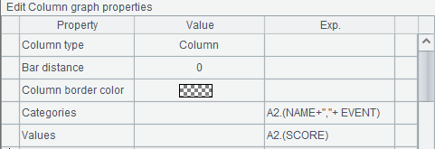
A3 sets properties for the column chart:

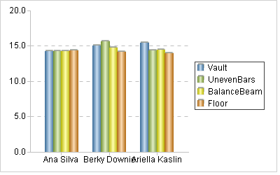
Like setting properties for an enumeration axis discussed in Coordinate Axes, setting Categories data for a column chart with both category and series should include both category value and series value. Here NAME is set as the category and EVENT set as the series. By default each category will be plotted as a cluster of columns of series. Below is A4’s plotting result:
Set Column type as Stacked Column to convert the column chart easily to a two-dimensional stacked column chart:
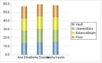
And the plotting result is:

After converting to a two-dimensional chart, the 3D axes become normal lines. By changing column type, you can use the column graph to plot a 3D stacked column chart, bar chart and many other charts.
12.11.2 Line graph
The line graph can be used to plot various charts like polyline charts, curve charts and radar charts. Below is the potting algorithm for a polyline chart displaying gym scores:
|
|
A |
|
1 |
=canvas() |
|
2 |
=demo.query("select * from GYMSCORE") |
|
3 |
=A1.plot("GraphLine","categories":A2.(NAME+","+EVENT), "values":A2.(SCORE),"yStartValue":12) |
|
4 |
=A1.draw@p(400,250) |
A3 sets properties of the line graph:
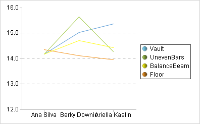
Using the category data and series data in the previous section, A4 gets the following plotting result:
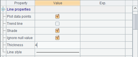
Set desired line style or plot dots on a polyline chart by setting line properties in A3:

Set both Plot data points and Shade as true and increase the Line thickness. Now the plotting result is:

In this case dots aren’t plotted and shading effect isn’t displayed; and the polyline becomes thicker.
Change the original line graph’s Type to Radar to plot a radar chart in a polar coordinate system:
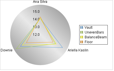
Plotting result is:
You can also plot a 3D polyline chart or a curve fitting plot by changing the line graph type.
12.11.3 Pie graph
esProc offers pie graph to plot various pie charts. Below is such a plotting algorithm:
|
|
A |
|
1 |
=canvas() |
|
2 |
=demo.query("select * from FRUITS") |
|
3 |
=A1.plot("GraphPie","categories":A2.(NAME),"values": A2.(UNITPRICE)) |
|
4 |
=A1.draw@p(400,250) |
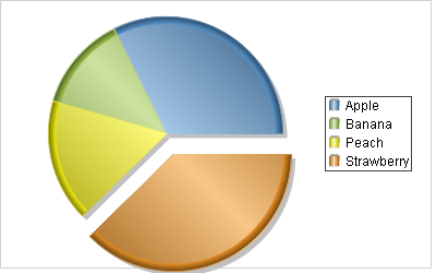
A3 plots a single-series pie chart. For multi-series pie chart plotting, data property setting is like that in a column chart/polyline chart with both category and series. This algorithm plots a legend on the right side according to the default chart configurations. A4’s plotting result is:

Modify A3 to set Pie type as 3D pie for plotting a 3D pie chart. And uncheck Cut-slice pie to disable the effect of exploding the sector:
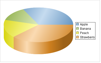
Here’s the plotting result:
12.11.4 Dual-axis graph
You use dual-axis graph to plot dual-axis column-and-polyline charts or dual-axis polyline charts. Below is the plotting algorithm for a dual-axis column-and-polyline chart:
|
|
A |
|
1 |
=canvas() |
|
2 |
=demo.query("select * from STATES where STATEID<6") |
|
3 |
=A2.new(ABBR,"Population":Type,POPULATION/1000000:Value) |
|
4 |
=A2.new(ABBR,"Area":Type,AREA/1000:Value) |
|
5 |
=A3|A4 |
|
6 |
=A1.plot("Graph2Axis","categories":A5.(ABBR+","+Type),"values": A5.(Value)"yTitle":"Population(M);Area(K sq. mi)","yTitleAngle":90,"axisRightColor":-3355444) |
|
7 |
=A1.draw@p(500,250) |
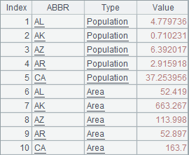
A5 concatenates records of population and those of areas to generate data for chart plotting:

Data property setting for a dual-axis column-and-polyline chart is similar to that for a column chart with both category and series:
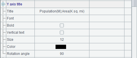
During setting the properties, titles are added for the two vertical axes with units designated. In this case a semicolon is used to separate them:
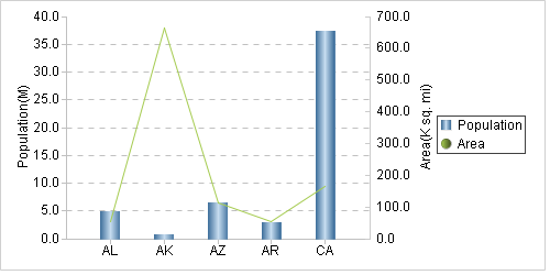
A6 removes shading effect for the polyline and increases the line thickness. Now here’s A7’s plotting result:

The data for chart plotting in the above algorithm includes only two series of data: population and area of each state. Plot the first data series as columns with the left vertical axis and plot the second data series as a polyline with the right vertical axis. If there are more than two series of data, plot them as columns and lines evenly.
Modify Type property of the dual-axis graph to 2Axis2Line:
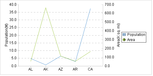
Then a dual-axis polyline chart will be plotted, in which the first data series will be plotted as a polyline with the left vertical axis. The plotting result is:

