Graph
This item helps you to design various types of graphs to present information of a report visually and intuitively.
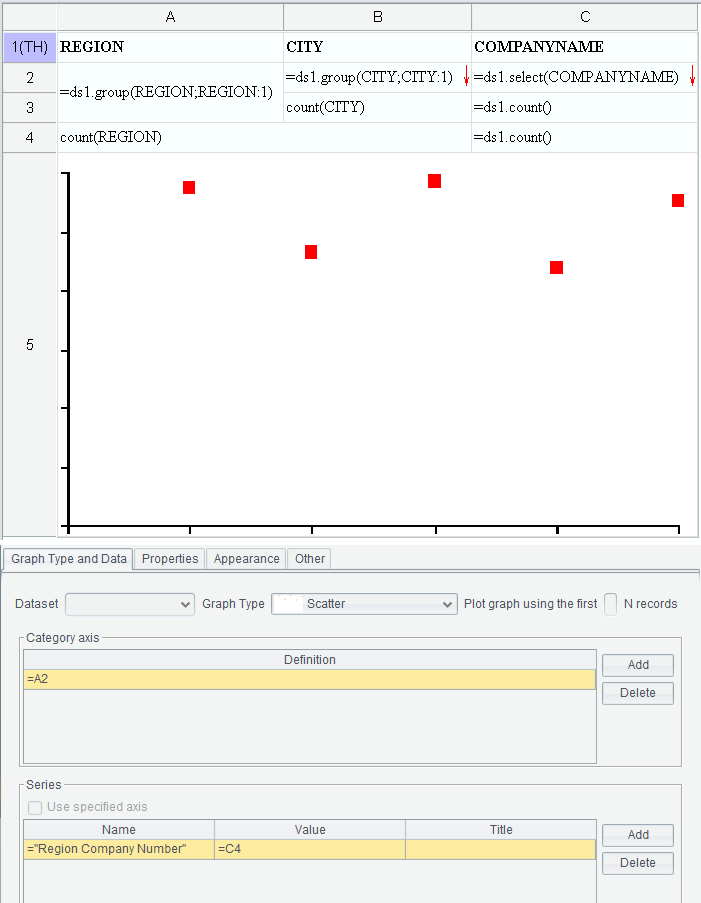
Select a cell where a graph will be plotted and click Report -> Graph or right-click menu -> Graph to pop up “Graph properties” interface, where you define related properties for the to-be-plotted graph, as the following figure shows:
When you finish configuring graph properties, click “OK” button and the desired graph will be automatically inserted into the cell selected in the designer.
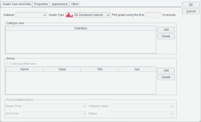
Graph Type and Data
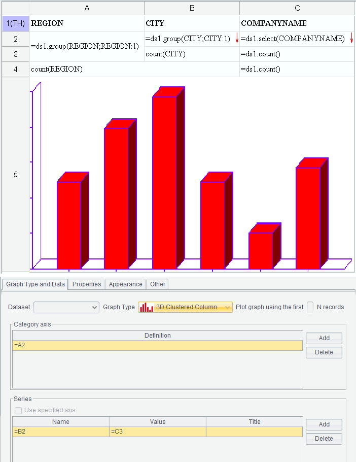
Click “Graph Type and Data” to enter the tab, as the above figure shows:
Dataset
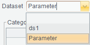
When you need to directly reference a dataset’s field or a parameter value in the graph data, you can select a reference type in the dataset drop-down list.
Ⅰ. Select parameter
Parameter:
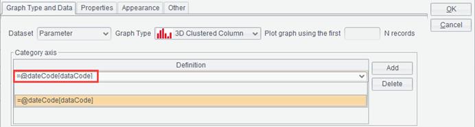
After the “Parameter” reference type is selected, the current parameters will be listed in the graph data drop-down list. Each parameter is displayed in the format of @parameter name[parameter description].
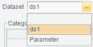
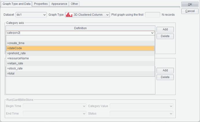
Ⅱ. Select a dataset name
Dataset ds1:
After a dataset name is selected, fields of the dataset will be automatically listed in the graph data drop-down list for selection:
Graph Type
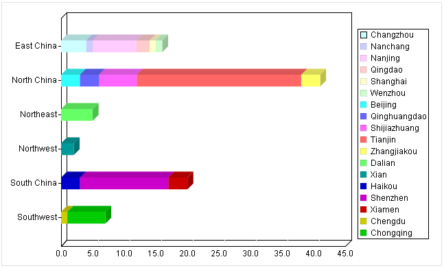
ReportLite supports thirty types of graphs, including Column, 3D Column, 3D Custered Column, Stacked Column, 3D Stacked Column, Pie, 3D Pie, Line, Curve, 3D Line, Area, 3D Area, Bar, 3D Clustered Bar, Stacked Bar, 3D Stacked Bar, Scatter, 3D Scatter, Run, Time Series, Dual-axis Column, Dual-axis Line, Dual-axis Stacked Line, Radar, Gantt, Dashboard, Milestone, 3D Dashboard, Range and ɪ-shaped. You can select the desired one in the drop-down list as needed.
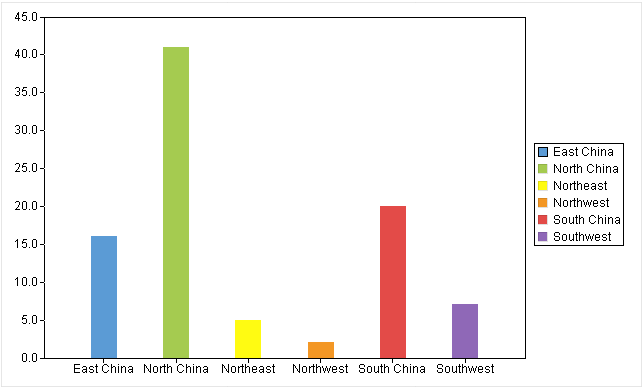
A column graph uses a unit length to represent a certain quantity. According to quantities, we draw a column graph where columns are proportional in length and are arranged in a certain order. The graph not only represents data in each group, but also makes it easy to compare differences between groups of data.
● Example: Find the number of companies in a certain region.
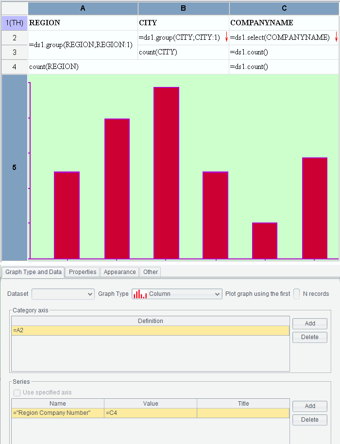
First, select “Column” under the “Graph Type” drop-down list;
Then, edit “Category axis” and “Series”. Details are explained in the respective sections;
Last, switch to “Properties” tab and “Appearance” tab to set up related properties. You can skip this step if you choose to use the default settings.
Click “OK” button to finish plotting the column graph. Here’s the preview effect:
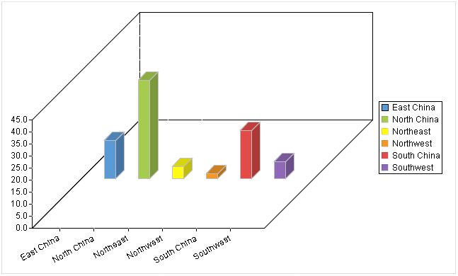
A 3D column graph is a column graph displayed in three-dimensional form, which produces a stereoscopic effect.
●Example: Find the number of companies in a certain region.
The plotting process is the same as that of the above column graph except that you need to choose “3D Column” graph type.
Below is the preview effect:
Based on a column graph, a 3D clustered column graph creates categories according to data on the categorical axis and displays data of each category in series in the form of columns.
● Example: Find the number of companies in each city of a certain region.
First, select “3D Clustered Column” under the “Graph Type” drop-down list;
Then, edit “Category axis” and “Series”. The series names are categories in the clustered column graph. Details are explained in the respective sections;
Last, switch to “Properties” tab and “Appearance” tab to set up related properties. You can skip this step if you choose to use the default settings.
Click “OK” button to finish plotting the 3D clustered column graph. Here’s the preview effect:
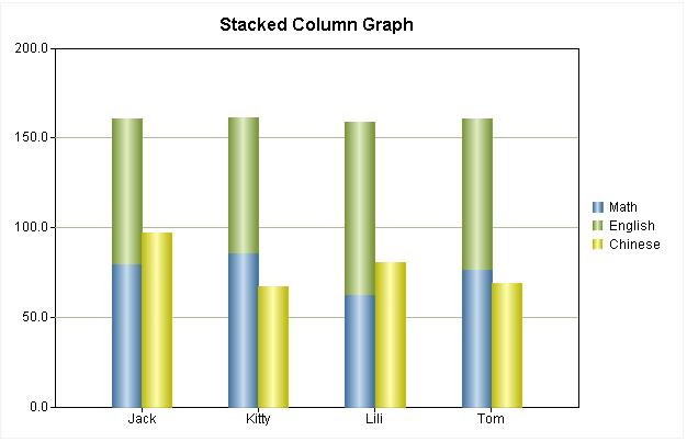
A stacked column graph uses same plotting rule as the 3D clustered column graph but it displays its series as stacked columns.
● Example: Find the number of companies in each city of a certain region.
The plotting process is the same as that of the above 3D clustered column graph except that you need to choose “Stacked Column” graph type.
Below is the preview effect:
A 3D stacked column graph displays data in a report in three-dimensional stacked columns in order to produce the stereoscopic effect.
● Example: Find the number of companies in each city of a certain region.
The plotting process is the same as that of the above stacked column graph except that you need to choose “3D Stacked Column” graph type.
Below is the preview effect:
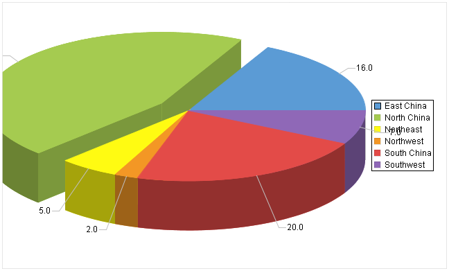
A pie graph displays data in a report in the form of pie and is one of the most commonly used forms of statistical graphs. Generally, the area of a circle is used to represent the whole, and the area of a sector is used to represent the percentage of the whole. A pie graph can clearly display the quantitative relationship between part and part, and part and whole.
● Example: Find the number of companies in a certain region.
The plotting process is the same as that of the column graph except that you need to choose “Pie” graph type.
Below is the preview effect:
A 3D pie graph displays data in a report in three-dimensional form to create the stereoscopic effect.
● Example: Find the number of companies in a certain region.
The plotting process is the same as that of the pie graph except that you need to choose “3D Pie” graph type.
Below is the preview effect:
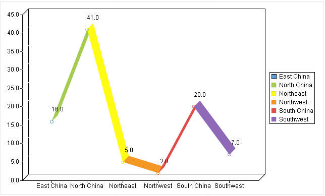
A statistical graph that represents the increase or decrease of the statistical quantity with the rise or fall of a line is called a line graph. Besides representing quantities, a line graph can also reflect the development and change of the same thing under different circumstances.
● Example: Find the number of companies in a certain region.
The plotting process is the same as that of the pie graph except that you need to choose “Line” graph type.
Below is the preview effect:
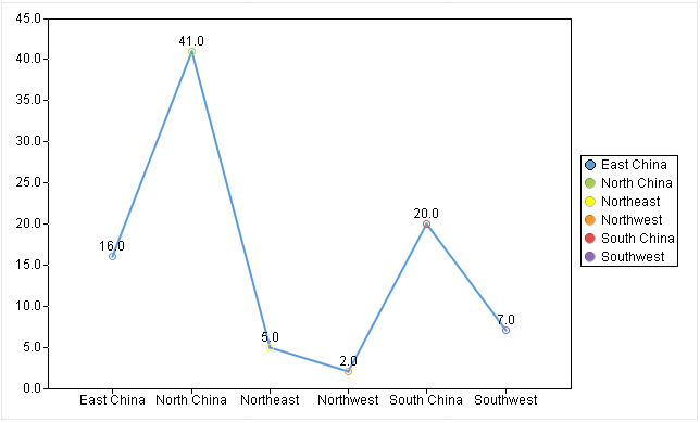
You can set up “Style” and “Line Weight” for a line graph. Details are explained in “Properties” section.
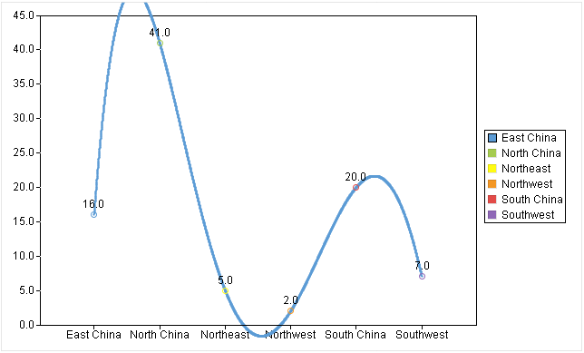
Like a line graph, a curved-line graph represents quantities and changes of the same thing under different circumstances. Difference is that the curved-line graph uses a smooth curved line to show them.
[]
● Example: Find the number of companies in a certain region.
The plotting process is the same as that of the pie graph except that you need to choose “Curve” graph type.
Below is the preview effect:
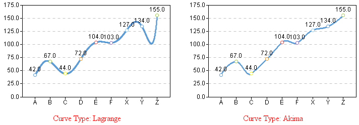
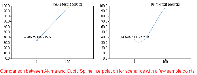
●Curve Type
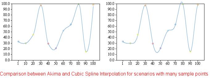
ReportLite offers three types of curved lines, letting users choose the most suitable one according to the dot distribution pattern.
Lagrange: Plot the curved-line graph according to the Lagrange function. The Lagrange type is likely to go out of bounds and it is recommended that you use it as cautiously as possible.
Akima: First-order smoothness (the first derivative is continuous). It has low degree of smoothness. The graphics are not so beautiful when there are only a few sample points, but it is not easy to go out of bounds when there are many sample points.
Cubic Spline Interpolation: Second-order smoothness (the second derivative is continuous). It has high degree of smoothness. The graphics are more beautiful when there are only a few sample points, but it is prone to go out of bounds when there are many sample points.
Below are comparisons between Akima type and Cubic Spline Interpolation type for scenarios with a few sample points and those with many sample points:
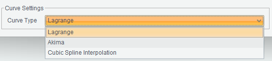
●Curve Settings:
First, right-click the cell containing the graph and select “Graph”;
Then, set up graph type as “Curve” on “Graph Properties” interface;
Last, click “Other” tab on “Graph Properties” interface and configure graph type, as shown below:
A 3D line graph displays data in a report in three-dimensional form to produce the stereoscopic effect.
● Example: Find the number of companies in a certain region.
The plotting process is the same as that of the line graph except that you need to choose “3D Line” graph type.
Below is the preview effect:
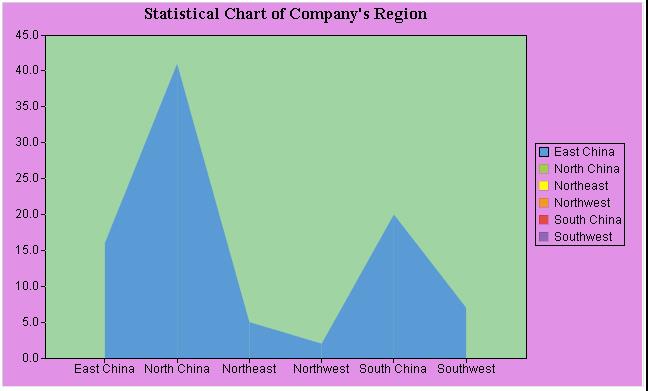
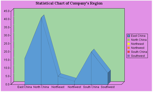
An area graph displays data in a report in multiple regions.
● Example: Find the number of companies in a certain region.
The plotting process is the same as that of the line graph except that you need to choose “Area” graph type.
Below is the preview effect:
A 3D area graph displays data in a report in three-dimensional form to produce the stereoscopic effect.
● Example: Find the number of companies in a certain region.
The plotting process is the same as that of the area graph except that you need to choose “3D Area” graph type.
Below is the preview effect:
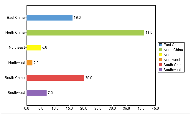
A bar graph represents data the same way as a column graph, but it displays columns in a horizontal way according to special requirements. That is why ReportLite offers the bar graph.
● Example: Find the number of companies in a certain region.
The plotting process is the same as that of the column graph except that you need to choose “Bar” graph type.
Below is the preview effect:
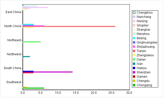
A 3D clustered bar graph represents data the same way as a 3D clustered column graph, but it displays the clustered columns in a horizontal way according to special requirements. That is why ReportLite offers the 3D clustered bar graph.
● Example: Find the number of companies in each city of a certain region.
The plotting process is the same as that of the 3D clustered column graph except that you need to choose “3D Clustered Bar” graph type.
Below is the preview effect:
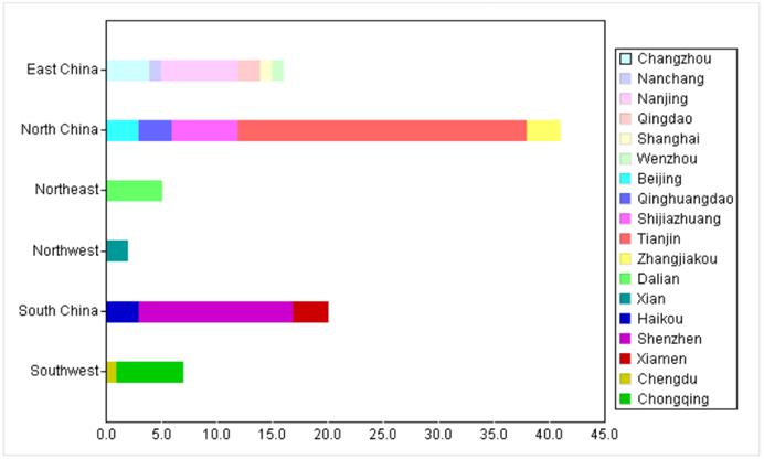
A stacked bar graph represents data the same way as a stacked column graph, but it displays the stacked columns in a horizontal way according to special requirements. That is why ReportLite offers the stacked bar graph.
● Example: Find the number of companies in each city of a certain region.
The plotting process is the same as that of the stacked column graph except that you need to choose “Stacked Bar” graph type.
Below is the preview effect:
A 3D stacked bar graph represents data the same way as a 3D stacked column graph, but it displays the 3D stacked columns in a horizontal way according to special requirements. That is why ReportLite offers the 3D stacked bar graph.
● Example: Find the number of companies in each city of a certain region.
The plotting process is the same as that of the 3D stacked column graph except that you need to choose “3D Stacked Bar” graph type.
Below is the preview effect:
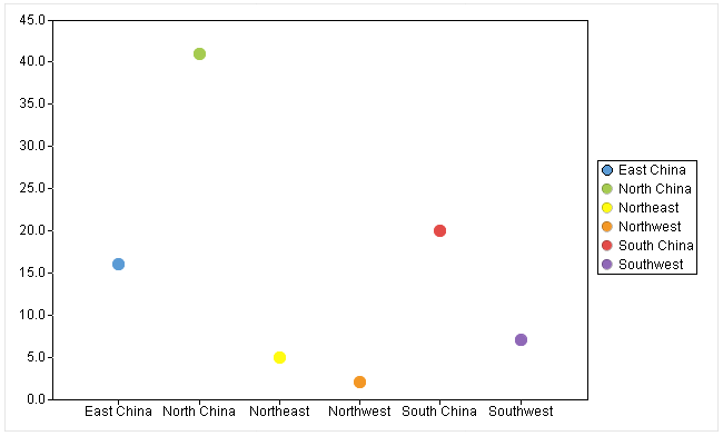
A scatter graph arranges report data in a two-dimensional coordinate system in a scattered way according to sizes of values. A scatter way only shows how much data a report has.
● Example: Find the number of companies in a certain region.
First, select “Scatter” under the “Graph Type” drop-down list;
Then, edit “Category axis” and “Series”. Details are explained in the respective sections;
Last, switch to “Properties” tab and “Appearance” tab to set up related properties. You can skip this step if you choose to use the default settings.
Click “OK” button to finish plotting the scatter graph. Here’s the preview effect:
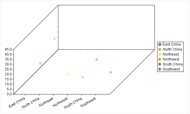
A 3D scatter graph displays data in a report in three-dimensional form to produce the stereoscopic effect.
● Example: Find the number of companies in a certain region.
The plotting process is the same as that of the scatter graph except that you need to choose “3D Scatter” graph type.
Below is the preview effect:
You do not need to define the Category axis and Series for a run graph. Only the begin time, end time, category value and status need to be defined.
Begin Time: Specify the beginning time for a time range; it is generally the value of a certain cell. So, just enter the cell’s name.
End Time: Specify the ending time for a time range; it is generally the value of a certain cell. So, just enter the cell’s name.
Category Value: Specify values of multiple categories. A category value is generally the value of a certain expanding cell – for which you just enter the cell’s name, or sometimes a constant. If the category value is value of a cell, the cell should be the master cell of the start time cell, end time cell and status cell.
Status: Specify status data; it is generally the value of a certain expanding cell. So, just enter the cell’s name.
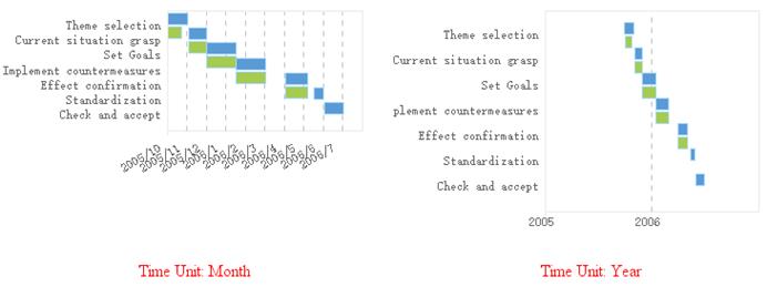
Time Unit: There are six types of time units: Year, Month, Day, Hour, Minute and Second.
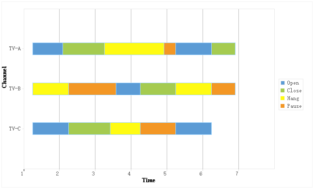
● Example: Plot a run graph representing statuses of each TV channel in different periods of time.
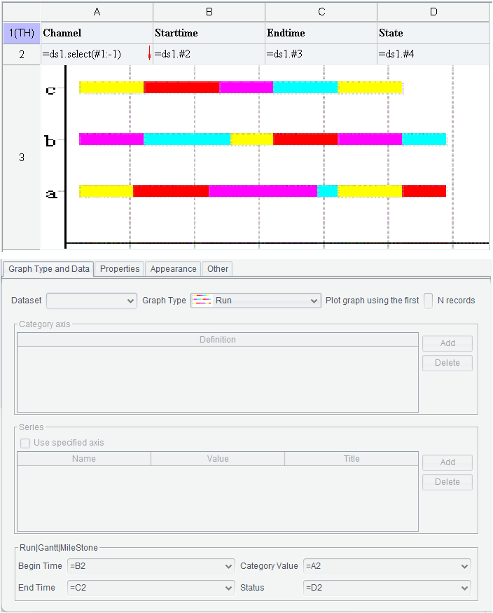
First, select “Run” under the “Graph Type” drop-down list;
Then, edit Begin Time, End Time, Category Value and Status.
●The Category axis and Series become invalid when the graph is a Run graph, Gantt graph or a Milestone graph.
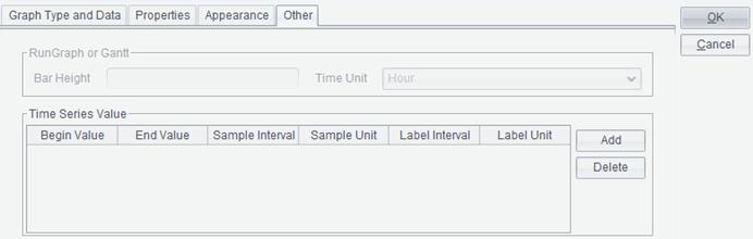
Then, switch to “Other” tab to set up Bar Height and Time Unit.
Last, switch to “Properties” tab and “Appearance” tab to set up related properties. You can skip this step if you choose to use the default settings.
Click “OK” button to finish plotting the run graph. Here’s the preview effect:
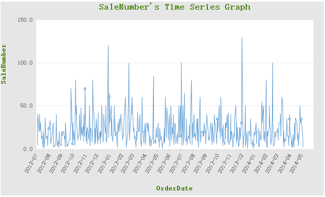
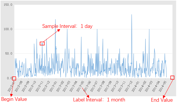
Often in some business requirements there is a large amount of data that changes over time. Due to the large size, plotting each piece of data during making a statistical graph where data changes over time will make the graph very difficult to discern. ReportLite specifically offers the time series graph to meet those requirements.
Switch to “Other” tab on the “Graph Properties” interface to configure “Time Series Value”:
Begin Value/End Value: Begin time and end time on the horizontal axis.
Sample Interval/Sample Unit: Get values during graph making according to sample unit and sample interval. Six types of sample units are offered – Year, Month, Day, Hour, Minute and Second. If sample interval value is 1 and sample unit is hour, get value every one hour for the time series graph.
Label Interval/Label Unit: Specify interval and unit for labels on the horizontal axis. Six types of label units are offered – Year, Month, Day, Hour, Minute and Second. If label interval value is 1 and label unit is month, plot labels on the horizontal axis every one month.
● Example: Make a time series graph reflecting changes of orders of certain product in a specified period of time.
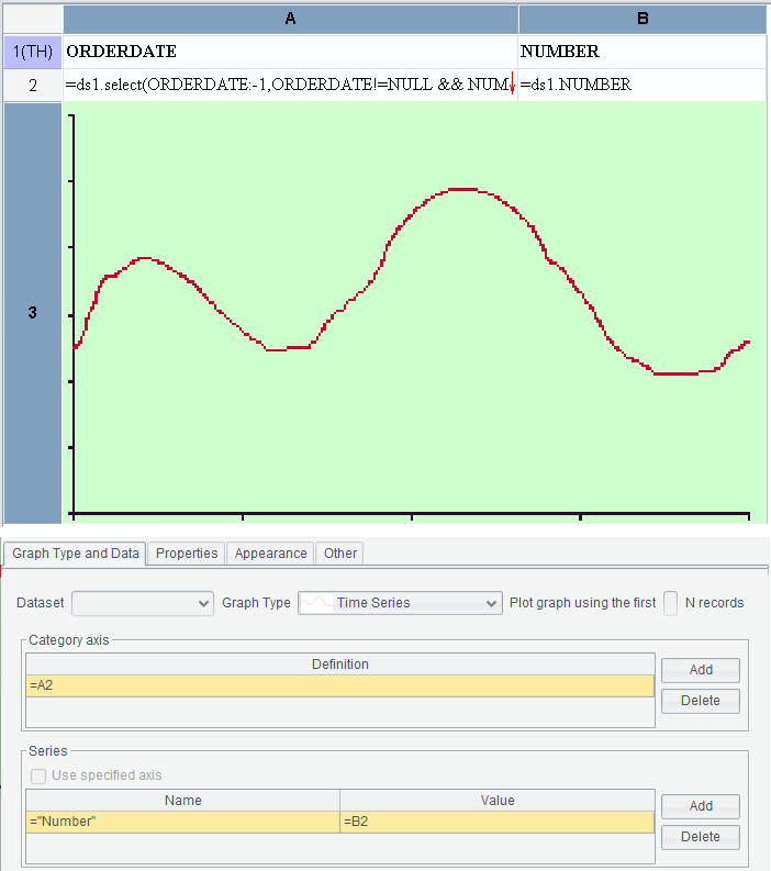
First, select “Time Series” under the “Graph Type” drop-down list;
Then, add Category axis and Series;
Then, switch to “Other” tab to set up “Time Series Value”.
Last, switch to “Properties” tab and “Appearance” tab to set up related properties as needed. You can skip this step if you choose to use the default settings.
Click “OK” button to finish plotting the time series graph. Here’s the preview effect:
For some business requirements, in order to make a clear comparison between two sets of data, it is necessary to display them on a horizontal axis at the same time. ReportLite supplies Dual-axis Column graph and Dual-axis Line graph to meet the requirements.
● Example: Make a Dual-axis Column graph representing both number of orders and freight.
Template is as follows:
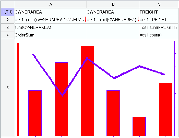
Below is graph definition in A5:
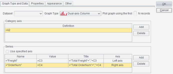
First, select “Dual-axis Column” under the “Graph Type” drop-down list;
Then, define Category axis, which is the horizontal axis definition, and two Series, where the first is column definition and the second is line definition;
Last, switch to “Properties” tab and “Appearance” tab to set up related properties as needed. You can skip this step if you choose to use the default settings.
Click “OK” button to finish plotting the dual-axis column graph. Here’s the preview effect:
Like a Dual-axis Column graph, a Dual-axis Line graph compares two sets of data, only with a different form. The latter uses two lines of different colors to represent the two sets of data.
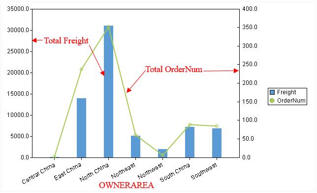
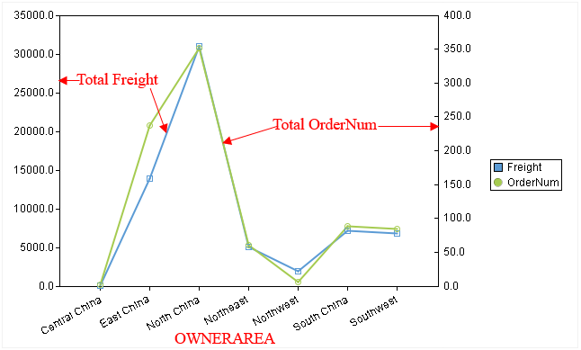
● Example: Make a Dual-axis Line graph representing both number of orders and freight.
Template is as follows:
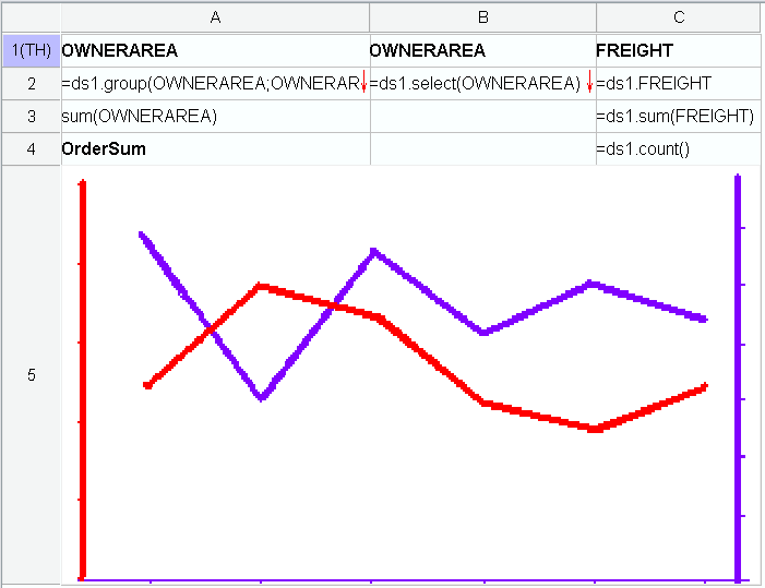
Below is graph definition in A5:
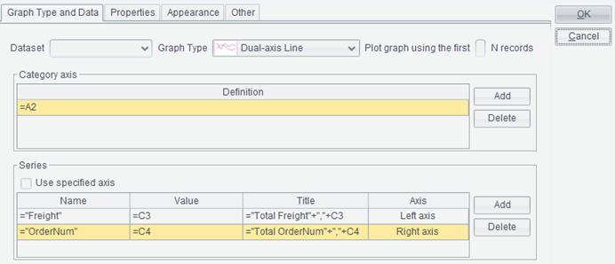
First, select “Dual-axis Line” under the “Graph Type” drop-down list;
Then, define Category axis, which is the horizontal axis definition, and two Series, which are the two lines in the graph;
Last, switch to “Properties” tab and “Appearance” tab to set up related properties as needed. You can skip this step if you choose to use the default settings.
Click “OK” button to finish plotting the dual-axis line graph. Here’s the preview effect:
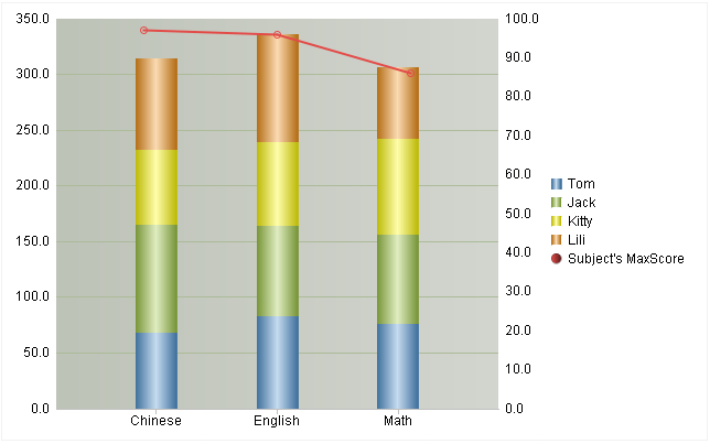
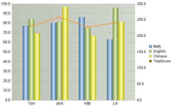
A Dual-axis Stacked Line graph is the combination of dual-axis graph and stacked graph. It uses stacked columns to represent series of data, and is able to display two sets of data visually.
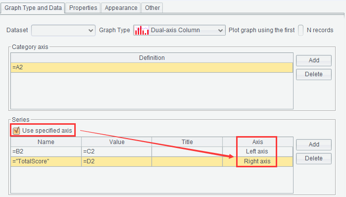
● Example: Make a Dual-axis Stacked Line graph to represent every student’s scores of all subjects and the best score of each subject.
Template is as follows:
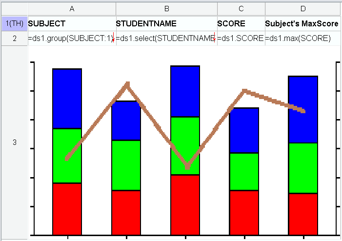
Below is graph definition in A3:
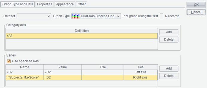
First, select “Dual-axis Stacked Line” under the “Graph Type” drop-down list;
Then, define Category axis and two Series; check the option “Use specified axis”;
Last, switch to “Properties” tab and “Appearance” tab to set up related properties as needed. You can skip this step if you choose to use the default settings.
Click “OK” button to finish plotting the dual-axis stacked line graph. Here’s the preview effect:
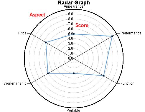
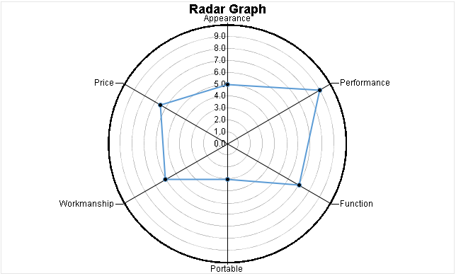
The above Radar graph displays a product’s performances in every aspect and estimates the product’s overall value visually. Sometimes we use area of the polygon in the middle as reference of the product quality.
● Example: Make a Radar graph to show performances of a product.
Template is as follows:
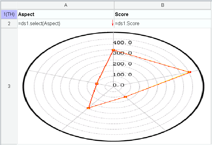
Below is graph definition in A3:
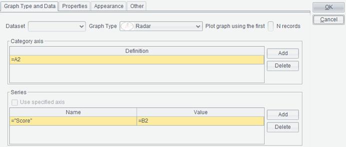
First, select “Radar” under the “Graph Type” drop-down list;
Then, define Category axis, which consists of definitions of projects on circumference in the graph, and Series, which is definition of radial value;
Last, switch to “Properties” tab and “Appearance” tab to set up related properties as needed. You can skip this step if you choose to use the default settings.
Click “OK” button to finish plotting the radar graph. Here’s the preview effect:
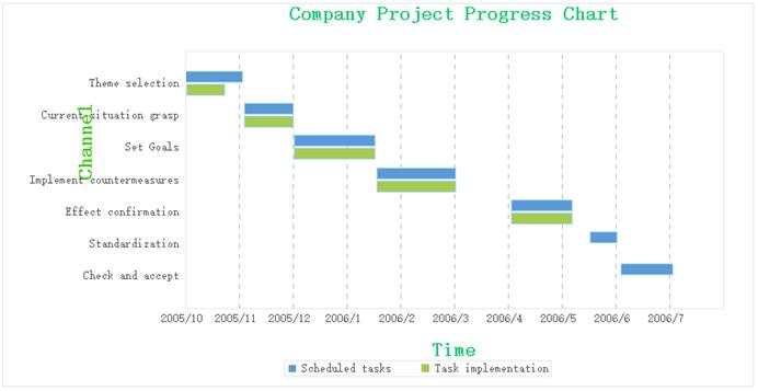
You do not need to define the Category axis and Series for a Gantt graph. Only the Begin Time, End Time, Project and Status need to be defined.
Begin Time: Specify a date field expression; the corresponding cell contains a date expression.
End Time: Specify a date field expression; the corresponding cell contains a date expression.
Project: Specify a list of tasks; the corresponding cell contains a task expression.
Status: Specify the current status of the task/project.
● Example: Make a Gantt graph to show status of projects in a company.
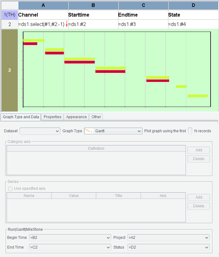
First, select “Gantt” under the “Graph Type” drop-down list.
Then, edit Begin Time, End Time, Project and Status.
Then, switch to “Other” tab to set up Bar Height and Time Unit.
Last, switch to “Properties” tab and “Appearance” tab to set up related properties. You can skip this step if you choose to use the default settings.
Click “OK” button to finish plotting the Gantt graph. Here’s the preview effect:
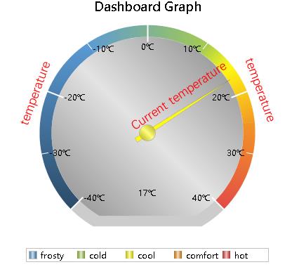
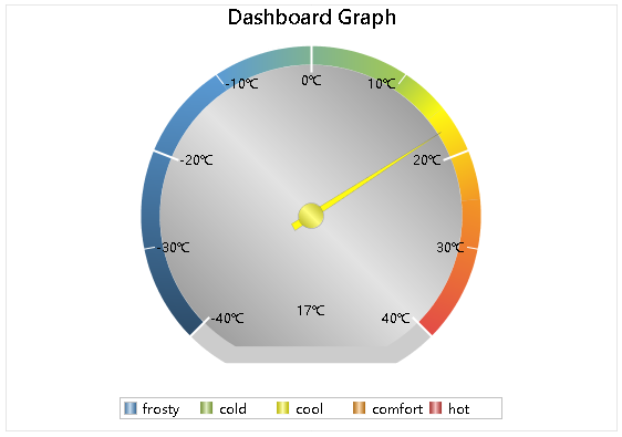
A Dashboard graph is essentially the same as the rectangular coordinate graph, except that the original horizontal axis is plotted as a circle. Values of the horizontal axis are located on the circumference, those of the vertical axis are painted along the circumference with colors, and the position indicated by the pointer is the current value. Note that data of the pointer in the graph should not be represented with any same color on the circle. It needs to be strictly distinguished.
With ReportLite, you can specify a data point as the pointer position by writing its corresponding value on the vertical axis as “value”.
● Example: Make a Dashboard graph reflecting changes of temperatures.
Template is as follows:
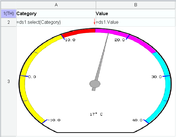
Below is graph definition in A3:
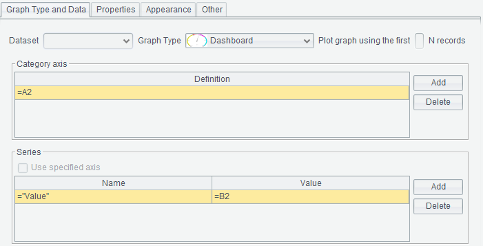
First, select “Dashboard” under the “Graph Type” drop-down list.
Then, define Category axis, which is definition of ticks on the circumference, and Series, which is definition of colors on the circumference.
Last, switch to “Properties” tab and “Appearance” tab to set up related properties. You can skip this step if you choose to use the default settings.
Click “OK” button to finish plotting the dashboard graph. Here’s the preview effect:
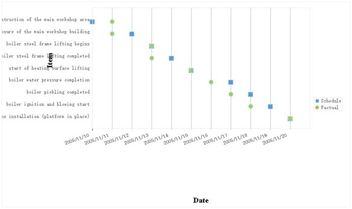
You do not need to define the Category axis and Series for a milestone graph. Only Schedule, Finish Time and Project need to be defined.
Schedule: The scheduled date when the task is completed; corresponding cell contains a date expression, such as 2006-01-01.
Finish Time: The actual date when the task is completed; corresponding cell contains a date expression, such as 2006-01-01.
Project: A list of tasks or projects, such as “zero meters for the foundation construction of the main workshop area”.
● Example: Make a Milestone graph reflecting how much tasks are carried out.
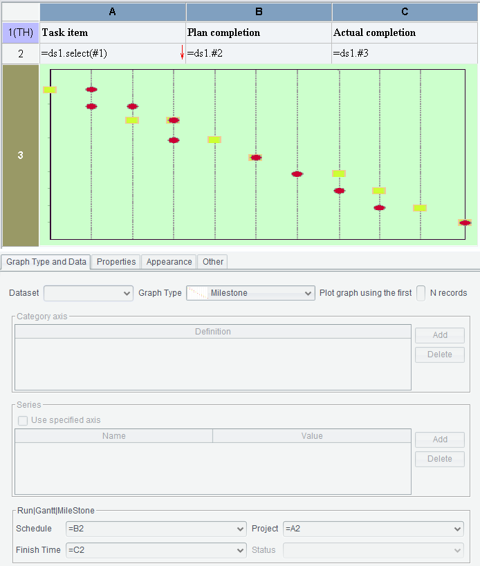
First, select “Milestone” under the “Graph Type” drop-down list.
Then, edit Schedule, Finish Time and Project.
Last, switch to “Properties” tab and “Appearance” tab to set up related properties. You can skip this step if you choose to use the default settings.
Click “OK” button to finish plotting the milestone graph. Here’s the preview effect:
A 3D Dashboard graph is a dashboard graph displayed in three-dimensional form, which produces a stereoscopic effect. The plotting process is the same as that of dashboard graph except that you need to choose “3D Dashboard” graph type.
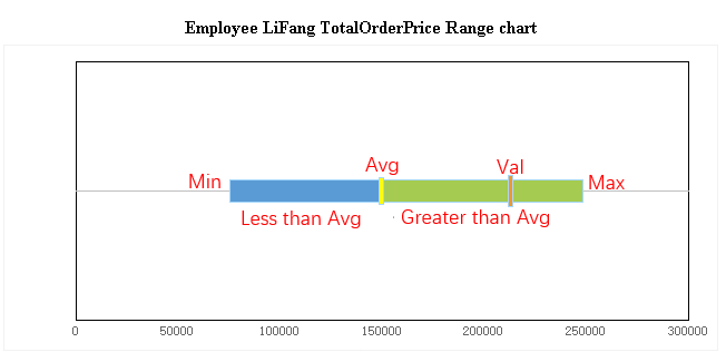
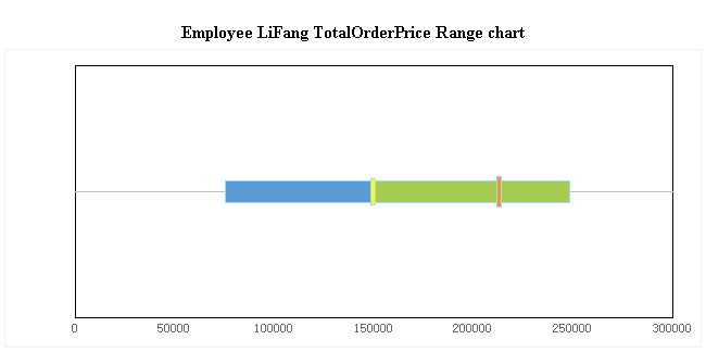
The figure shows position of an employee’s performance in terms of total order amount among all employees.
The horizontal axis shows order amounts, and there isn’t a vertical axis. The horizontal bar displays the range of total order amount for all employees. At the left end of the bar there is the minimum value and at the right end the maximum value is displayed. The yellow vertical separating line in the middle shows the average value. The left part of the bar, where values are below the average, is highlighted in blue, and the right part of the bar, where values are above the average, has green color. The relatively longer separating line in red shows position of the specified employee under query.
A range graph is like an I-shaped graph where an “I” is put horizontally. Yet for this example, the business logic is not the same as that for an I-shaped graph.
● Example: Make a Range graph to show position of a certain employee’s performance in terms of total order amount among all employees
Template is as follows:
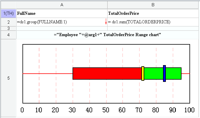
Below is graph definition in A5:
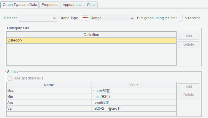
First, select “Range” under the “Graph Type” drop-down list.
Then, define Category axis and Series. The Category axis definition makes no sense because there is only one piece of data and one series. After adding the Category axis, four Series will be automatically added in the lower part of the interface and can’t be modified according to the range graph rule. The four Series specify max value, min value, average value and current value respectively. No legends will be displayed in a range graph, so series titles are not available.
Last, switch to “Properties” tab and “Appearance” tab to set up related properties. You can skip this step if you choose to use the default settings.
Click “OK” button to finish plotting the range graph. Here’s the preview effect:
The I-shaped graph is offered in ReportLite to meet the business requirements for displaying changes and comparison of variation range, mean value and current value of a set of values.
Template is as follows:
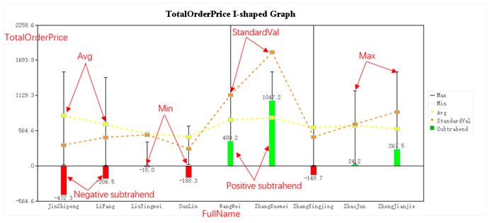
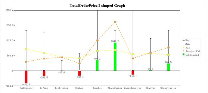
This graph shows the total sales of each salesperson in the company. The horizontal axis represents each employee, and the vertical axis represents the total order amounts. The upper horizontal line of each “I” represents the maximum value of the total sales, and the lower horizontal line represents the minimum value of the total sales. The yellow square represents the average value, and the red square represents location of the current value. This current value can be randomly specified by the user, and is used to compare with the overall data in the graph. The red and green bars near the 0 axis represent the difference, that is, the difference between the current value and the average value. For the sake of comparison, they are placed at the starting point of 0 on the horizontal axis. A positive value is an upward green bar, and a negative value is a downward red bar.
●Example: make an I-shaped graph to show total sales of each salesperson in a company.
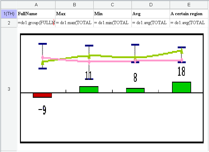
Below is graph definition in A3:
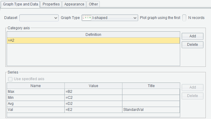
First, select “I-shaped” under the “Graph Type” drop-down list.
Then, define Category axis and Series. The Category axis is the horizonal axis definition. After adding the Category axis, four Series will be automatically added in the lower part of the interface and can’t be modified according to the I-shaped graph rule. The four Series specify max value, min value, average value and current value respectively. The “Title” column specifies labels displayed in the graph and can be named as you like.
Last, switch to “Properties” tab and “Appearance” tab to set up related properties. You can skip this step if you choose to use the default settings.
Click “OK” button to finish plotting the I-shaped graph. Here’s the preview effect:
Plot graph using the first N records
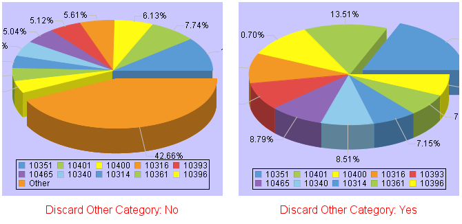
Sometimes there are a lot of data categories for graph plotting, making the outcome too dense to be readable. Therefore, the first few records with the largest data values are often used to draw the graph. This is often used in plotting pie graphs because such a graph becomes illegible when there are too many categories.
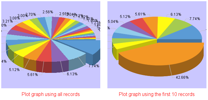
When only the first few pieces of data are used for plotting a pie graph, the system will merge the remaining data into “Other” and display them as a separate category (as shown in the figure below) in order to ensure data integrity:
Category axis
A Category axis is equivalent to a horizontal axis.
To plot a statistical graph representing students’ grades in each subject, data is categorized by students, so the cell displaying the student’s name is the Category axis. If the cell is A2, enter name of the cell, such as: =A2.
A graph generally has only one Category axis definition, but some graphs have multiple Category axis definitions. At this time, click a Category axis and the corresponding series definition is displayed in the “Series” box below.
The definition of Category axis for a graph can be a cell or a constant.
This property is valid when graph type isn’t Run graph, Gantt graph and Milestone graph.
●Every expression should be preceded by an equals sign in a graph definition.
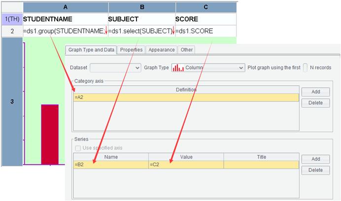
Series
A type of data values for plotting a graph is called a series. A Category axis can correspond to multiple series. A Series consists of series names and series values. For example, when using students’ math, Chinese, and English scores to draw a graph, each subject is a series.
The value of series name can be a cell or a constant.
A series value defines data source of this series, and its filling method is similar to that for the Category axis definition. The series value can be a constant or a cell.
This property is valid when graph type isn’t Run graph, Gantt graph and Milestone graph.
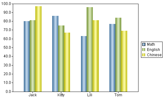
●Example:
Below is the preview effect:
Use specified axis
This option can only be checked for a dual-axis graph. Only by checking “Use specified axis”, you can define which series are located in the right axis and which ones are put in the left axis. Without checking this option, even if you define the right or left axis, the system will allocate all series values to the right and left axes evenly.
●Example:
Below is graph definition in A3:
Below is preview effect:
Run|Gantt|MileStone
See details in Run graph, Gantt graph and Milestone graph sections.
Properties:
Switch to “Properties -> General” tab as follows:
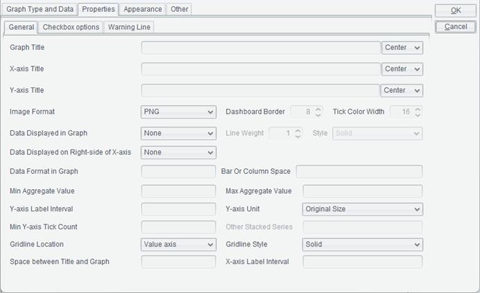
Graph Title
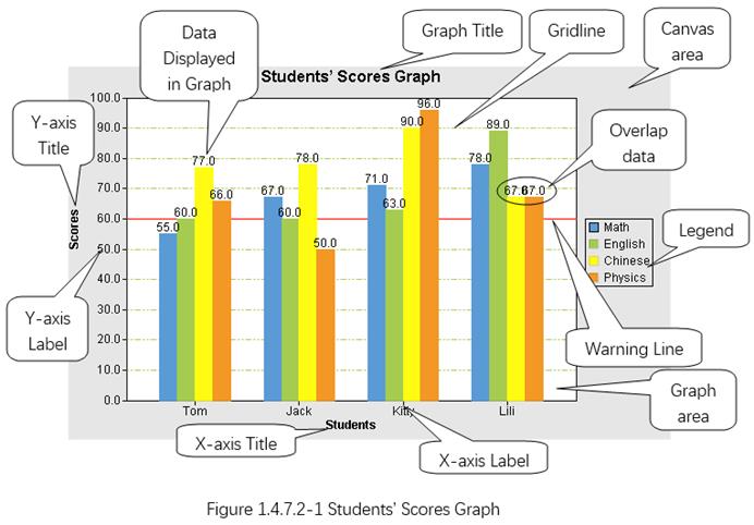
The graph title refers to a graph’s text title, which is generally displayed above the graph, such as Students’ Scores Graph in figure 1.4.7.2-1.
Select location of the graph title in the Graph Title drop-down list: Center, Left or Right.
X-axis Title
An X-axis title refers to the text title of X-axis, which is generally displayed below the horizontal coordinate axis, such as “Students” in figure 1.4.7.2-1:
Select location of the X-axis title in the X-axis Title drop-down list: Center, Left or Right.
Y-axis Title
A Y-axis title refers to the text title of Y-axis, which is generally displayed to the left of the vertical coordinate axis, such as “Scores” in figure 1.4.7.2-1:
Select location of the Y-axis title in the Y-axis Title drop-down list: Center, Top or Bottom.
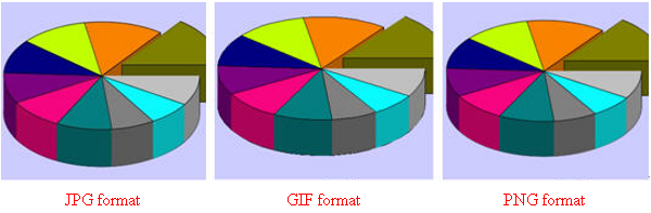
Image Format
You can choose one of the three image formats when outputting a graph – JPG, GIF and PNG. Among them, the edge of a graph in JPG format are blurred. A graph in GIF format has sharp edges and only supports 256 colors. The edge effect of a PNG format graph is between JPG and GIF, which is an ideal one.
NOTE:
In order to make the curve look smooth, the reporting tool smooths a graph when plotting it. Therefore, a lot of intermediate colors will be generated during pie graph plotting. Since the GIF format supports 256 colors at most, applying the GIF format to a pie graph will usually report an exception "Too many colors for a GIF". It is recommended not to use the GIF format when such an exception appears.
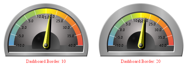
Dashboard Border
Dashboard Border specifies width of the dashboard, whose value is the percentage of the border and the radius. The item only applies to 3D Dashboard graphs.
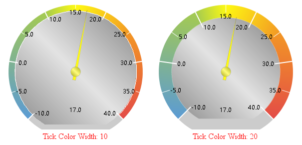
Tick Color Width
Tick Color Width refers to width of the Dashboard graph’s colored area. Its value is percentage of colored area width and the radius.
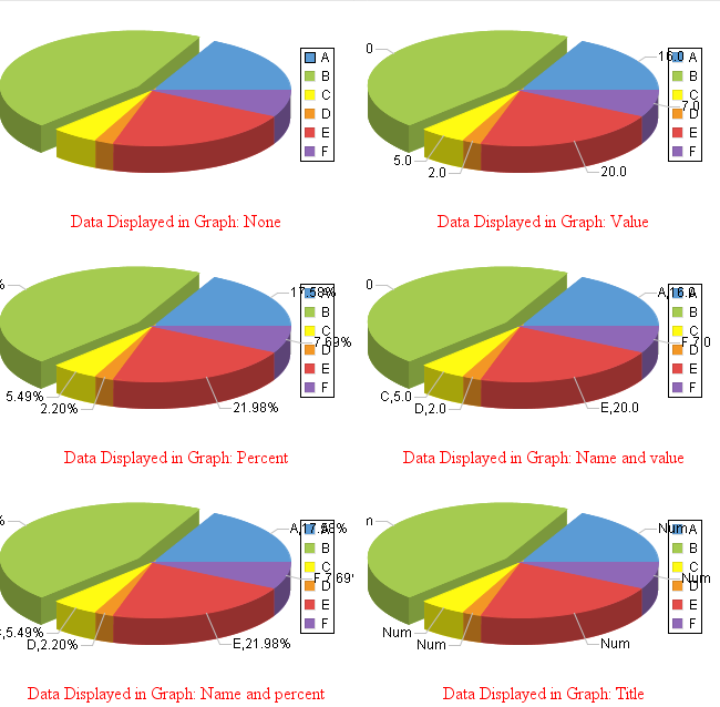
Data Displayed in Graph
There are six types of data marked in the pie graph – None, Value, Percent, Name and value, Name and percent, and Title.
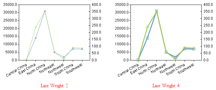
Line Weight
Set thickness for lines in Line graphs and Dual-axis Line graphs.
(Note: Sizes of data points change as thickness of lines changes)
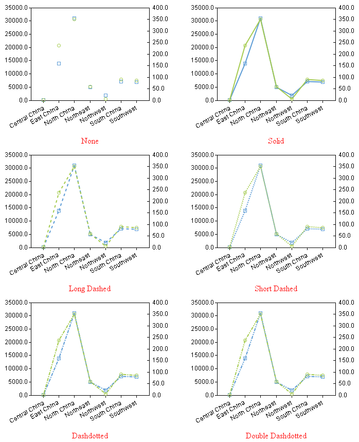
Style
Set up line style for Line graphs and Dual-axis Line graphs.
Data Displayed on Right-side of X-axis
There are four ways to mark data on the right-side of X-axis – None, Value, Name and value, and Title.
Data Format in Graph
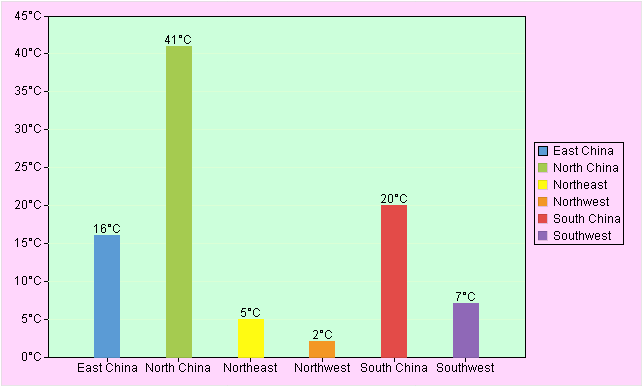
To display data in a graph, you need to define format for the data. One example is to display temperatures in a graph, you can set data format as ##°C, as the shown in the following figure:
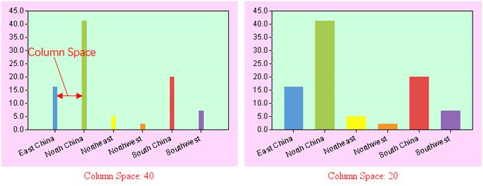
Bar Or Column Space
Specify spaces between columns in a column graph or bars in a bar graph.
Min Aggregate Value/Max Aggregate Value/Y-axis Label Interval
Sometimes statistical values of a graph are very large, while data differences between different categories and series are relatively small. In order to clearly mark data differences for categories and series, often a certain data area in the graph is partially enlarged. So, it is necessary to define the Minimum Aggregate Value, Max Aggregate Value and Y-axis Label Interval.
For example, there is a graph displaying the number of orders in each region. Each number falls between 1000 and 2000. Below is the graph without setting the Minimum Aggregate Value, Max Aggregate Value and Y-axis Label Interval:
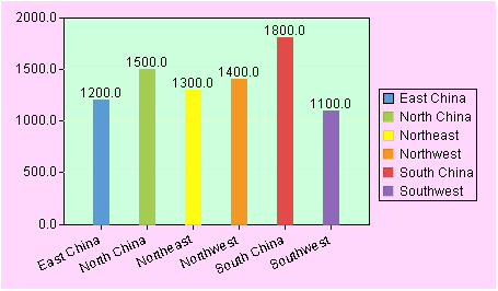
If we set the Minimum Aggregate Value as 1,000, the Maximum Aggregate Value as 2,000, and Y-axis Label Interval as 100, we will plot a statistical graph as follows:
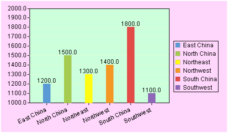
● Note: The three properties – Min Aggregate Value, Max Aggregate Value and Y-axis Label Interval- need to be set up at the same time to plot a graph in the expected way.
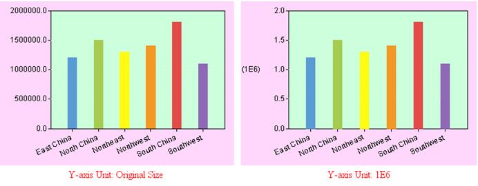
Y-axis Unit
You can set the unit of statistical values through Y-axis Unit. A series of options are offered, including Original Size, Auto Size, 1/1,000, 1/10,000, 1/1,000,000, and others. Below are two example graphs using different units:
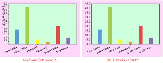
Min Y-axis Tick Count
The minimum number of statistical value ticks displayed on the Y-axis.
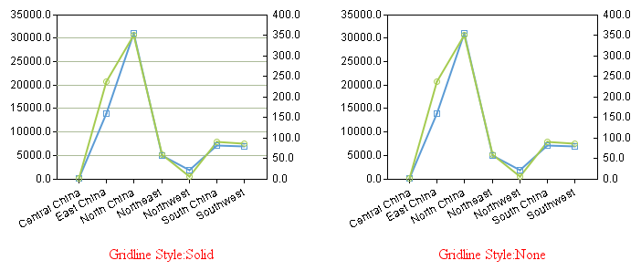
Gridline Style
Here the gridline style refers to the style of ticks on a statistical graph. You can choose not to set the gridline style.
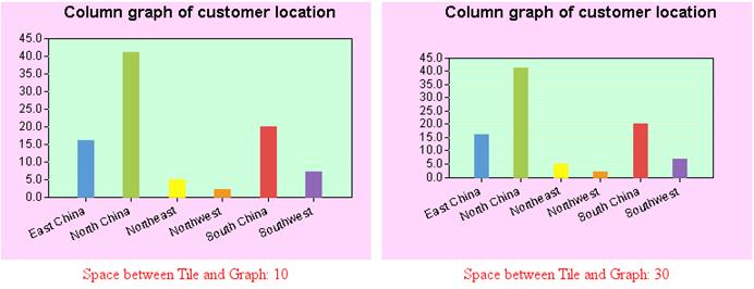
Space between Tile and Graph
Through this item you can set up the distance between the graph area and the graph title.
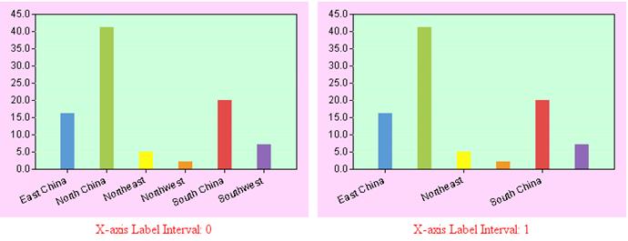
X-axis Label Interval
This item is for setting up spaces between labels on the category axis.
Other Stacked Series
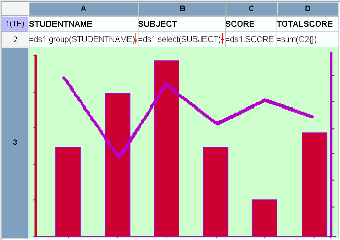
Display a certain series separately in a stacked graph. Value of this property is a series name. The property is valid only when the graph type is a stacked one.
Gridline Location
Set gridline location for Category axis or Value axis, or Both, in a graph.
For Value axis:
for Both:
Gridline Style
The property is for setting up style of gridlines for both category axis and value axis.
Below is “Checkbox options” tab:
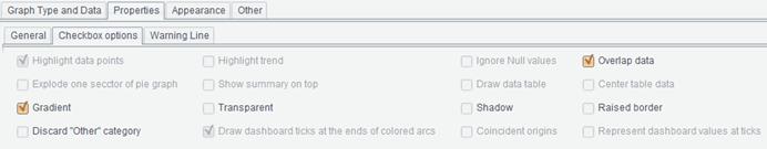
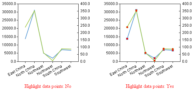
Highlight data points
The property lets you choose to highlight squares or points showing data positions in line graphs or not, and is valid only when the graph style is line-related. By checking this property, each category label on the line graph will be marked by a highlighted by a certain mark.
Fill color of the data points can be configured in Appearance -> Axis Color -> Column Border/Punc fill color.
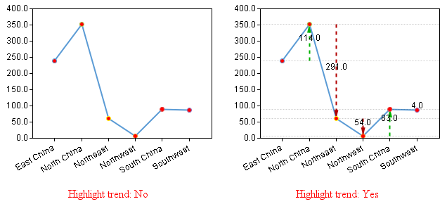
Highlight trend
Whether or not to highlight the trend of changes of data positions on a line graph.
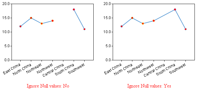
Ignore Null values
Whether or not to represent records containing null values in a graph.
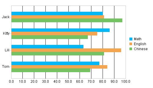
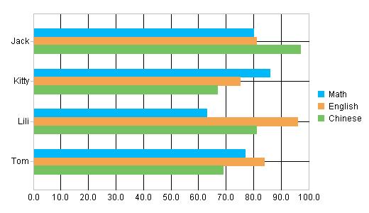
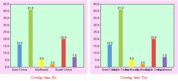
Overlap data
Whether or not to display the second value or label when two neighboring values or labels overlap.
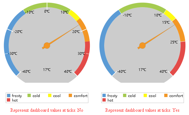
Represent dashboard values at ticks
Whether or not to plot ticks according to dashboard values.
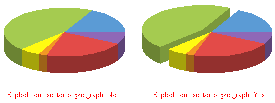
Explode one sector of pie graph
Whether or not to explode one of the sectors of a pie graph.
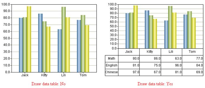
Draw data table
Whether or not to plot a data table.
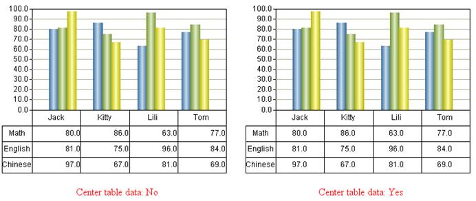
Center table data
Whether or not to center-align table data.
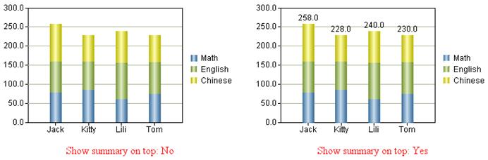
Show summary on top
Whether or not to display summaries on the top of columns.
Gradient
Whether or not to display gradient colors in a graph.
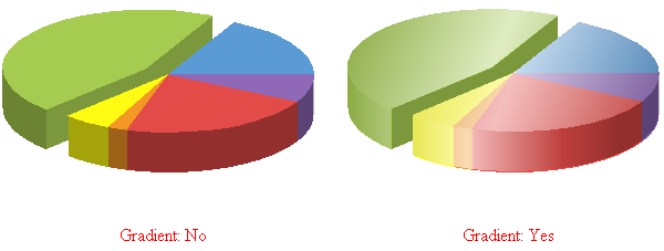
For a 3D graph, check the “Gradient” property and axis platform will be automatically plotted according to the axis line color, as the following figure shows:
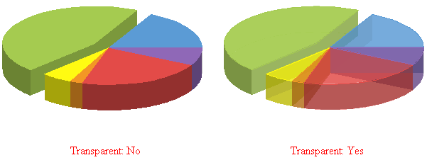
Transparent
Whether or not to create transparent effect for a 3D graph.
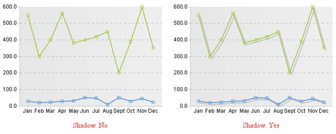
Shadow
Whether or not to display a graph’s shadow.
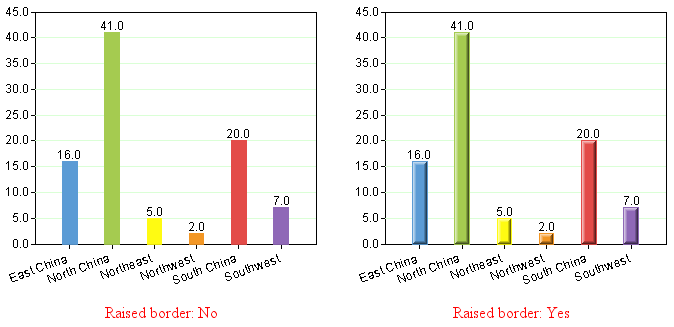
Raised border
Use raised border for column-related graphs.
Discard “Other” category
See Plot graph using the first N records.
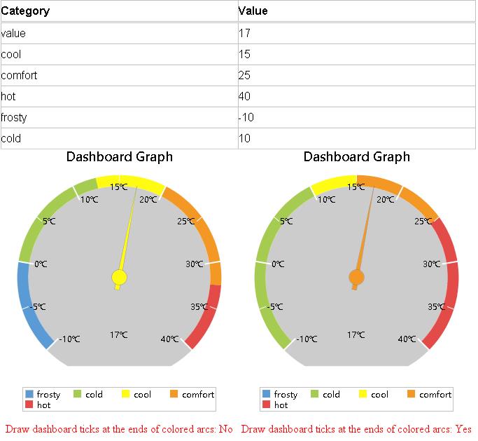
Draw dashboard ticks at the ends of colored arcs
Whether or not to place dashboard ticks at the ends of colored arcs.
When using a dashboard to display temperatures, you cannot check this checkbox because the division of temperatures is usually a range of values, rather than a fixed value. For example, -10 degrees is severely cold and 10 degrees is cold, then when using a range between the two, -10 degrees to 0 degrees represents severely cold and 0 degrees to 10 degrees represents cold.
Coincident origins
Whether or not to plot a graph beginning from the origin.
Warning Line
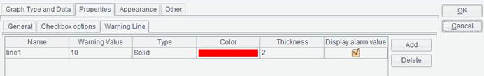
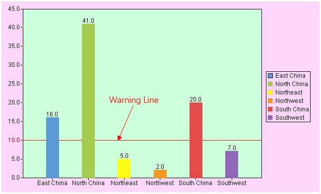
You can set warning line for a column graph/line graph. When a statistical value is equivalent to or greater than the specified warning value, a warning line will be marked in the graph according to the defined color and line style. Click “Add” button on the “Warning Line” group box to add a warning line, for which you can set a series of properties, including Name, Warning value, Type, Color, Thickness and Display warning value. For instance, we define a warning line and when the statistical value is 10 or above, the value will be marked by a red line.
Below is preview effect:
Appearance
Switch to “Appearance” tab on the “Graph Properties” interface, as shown below:
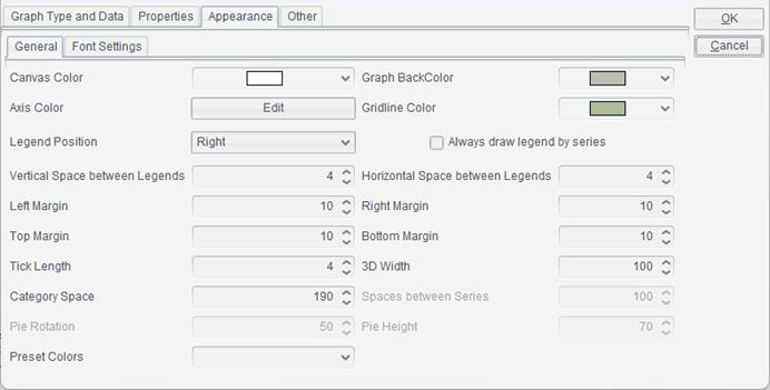
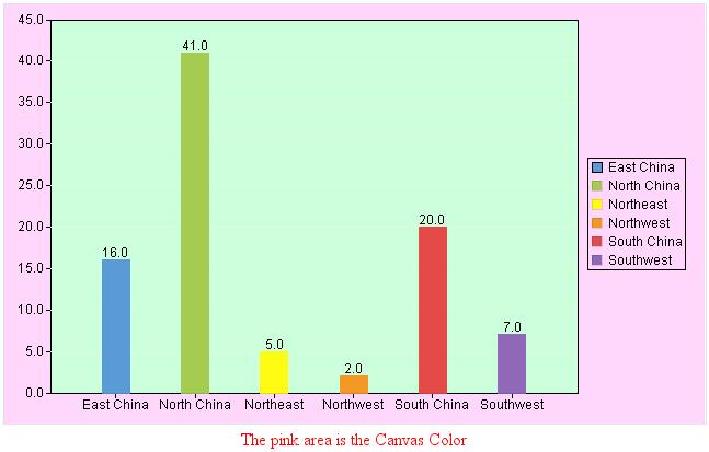
Canvas Color
Set the background color of the whole canvas.
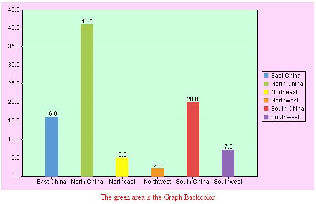
Graph BackColor
Set the background color of the graph area.
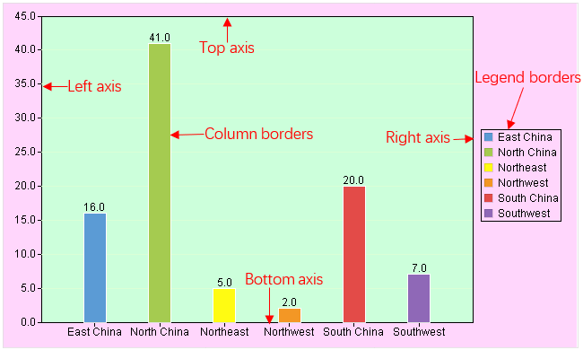
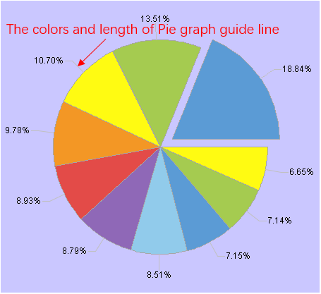
Axis Color
Set colors and lengths of graph axes, legend borders, column borders and pie chart guide line. Through configuring column border color, you an set fill color for data points in a line graph; the default fill color is transparent.
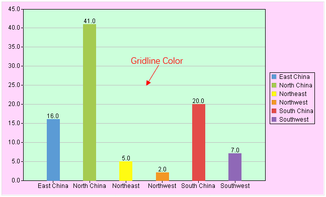
Gridline Color
Set color for the gridline. The property is valid only when gridlines are displayed.
●Excel supports 256 colors while ReportLite supports any colors. So, certain colors do not have counterparts when outputting the graph to Excel. In that case, the system will find the closest replacement in Excel.
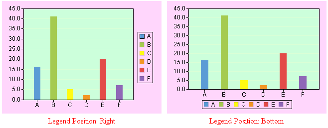
Legend Position
Set the position of legends in a graph. There are five choices – Top, Bottom, Left, Right and None.
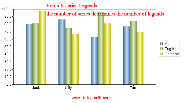
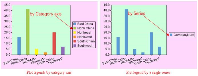
Always draw legend by series
Generally, legends are plotted according to series. When there is only one series and you select this option, the legend will still be plotted according to the series; without selecting this option, legends will be plotted according to the category axis.
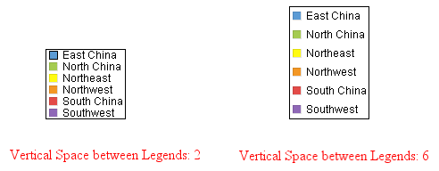
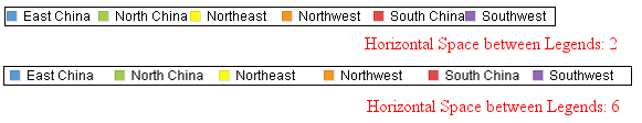
Vertical/Horizontal Space between Legends
Set vertical and horizontal space between legends and change it as needed.
Preset Colors
Select color palette for a graph. You can directly use the palette ReportLite offers or change the existing palette or define a new one through “Tools -> Color Scheme”.
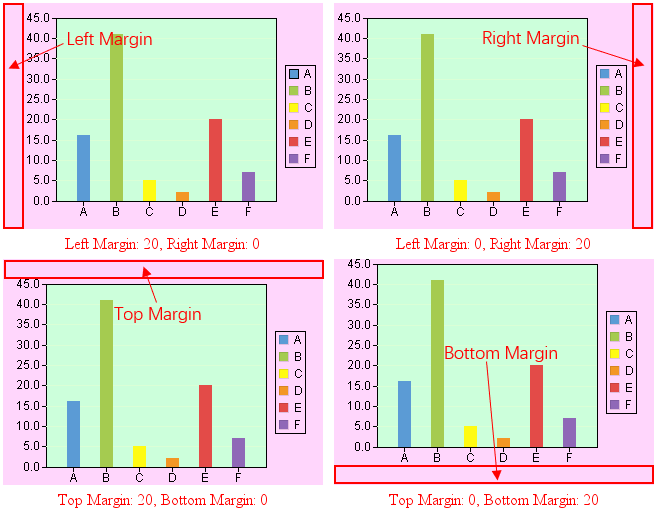
Left Margin/Right Margin/Top Margin/Bottom Margin
Set location of the graph on the canvas.
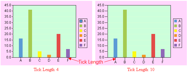
Tick Length
Set length of ticks on axes.
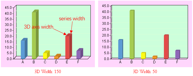
3D Width
Set percentage between 3D axis width and series width.
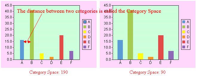
Category Space
Set percentage between category space and series width.
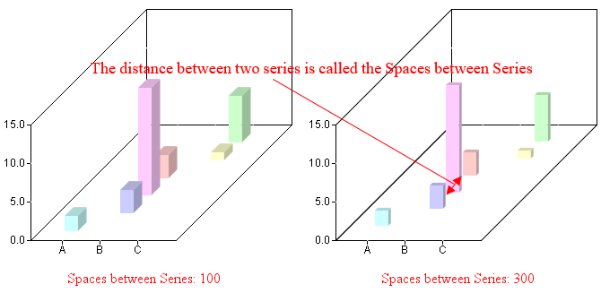
Spaces between Series
Set percentage between series space and series depth.
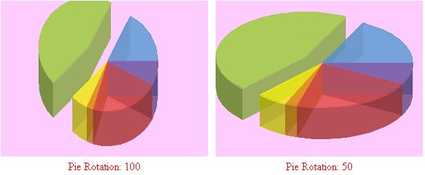
Pie Rotation
Set percentage between Y-axis length and X-axis length in a pie chart.
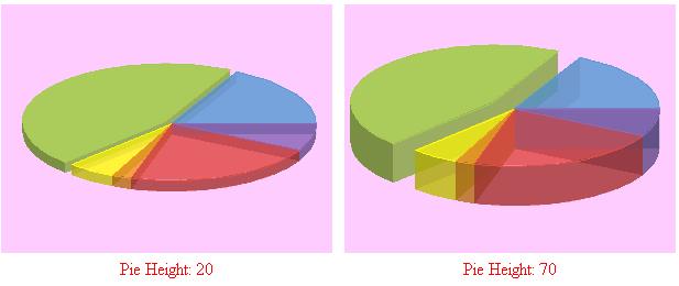
Pie Height
Set Percentage between pie height and radius.
Font Settings
Set a series of properties under this item, including font, font color, font size, rotate angle, and so on for text in graph/X-axis/Y-axis titles and labels. To use the Chinese fonts under a non-Chinese OS, you need to install the corresponding installer. If the OS doesn’t support a certain font, the graph cannot be output as expected.
Other
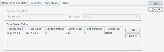
Switch “Other” tab on the “Graph Properties” interface, as shown below:
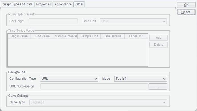
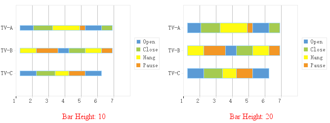
Bar Height
Set height of status bars in a run graph or a Gantt graph.
Time Unit
Set Unit of the time scales in a run graph or a Gantt graph, including Year, Month, Day, Hour, Minute and Second.
Time Series Value
Under this property, you can set Begin Value, End Value, Sample Interval, Sample Unit, Label Interval and Label Unit for values on the horizontal axis in a run graph. Values of Sample Unit and Label Unit can be Year, Month, Day, Hour, Minute or Second.
Background
Set the background image for a graph.
Note: You need
to set both “Canvas Color” and “Graph Backcolor” as “Transparent” (![]() ) to
make the background image visible.
) to
make the background image visible.
Configuration Type
The configuration type of a background image can be a URL or an Expression. If the background image used for a graph in a report is an image file, choose the “URL “configuration type; if the background image is represented by a byte array returned by an expression, choose the “Expression” configuration type.
Mode
There are three modes for a background image – Top left, Fill and Tile.
URL/Expression
A URL can be an absolute path or a relative path. A relative path is relative to Tools -> Options -> File -> Resource directory. The property corresponds to the path in “home” property under “Report” in configuration file raqsoftConfig.xml. A relative path does not need to be preceded by a slash “/”.
Result of computing an “Expression” should be image, such as the binary streams.
Curve Type
Set the type of curve under plotting, including Lagrange, Akima and Cubic Spline Interpolation.